(The full version is 12960 pixels across and its scalable vectors give my processor its long desired workout, it was beginning to put on some pounds after all those mp3s and spreadsheets.)

- Upon migration the URL for archives was reset so all updated archives linked to a 404. I quickly fixed this once my server, that has been up and down a bit lately, allowed me back into the FTP.
- Previous Post links have stopped working, the conventional
tag instead of providing a list of the 10 posts prior to the post being viewed now shows only the ten most recent posts. This makes navigation of the older pages less fluid and to find old posts you need to visit label pages or archive pages with the aim of finding a specific post. - The uploading dialogue for blogger has also been tweaked, it now shows the successfully uploaded files in a list and when errors occurs it tells you them. A nice addition to this would be a suggestion on whether or not to perform a republish based upon the severity of FTP errors. When I see the errors I ask myself whether or not all the files uploaded ok - the last thing I need is a corrupted page that I don't know about. One caveat of this new system is the removal of the percentage uploaded indicator, I like to know how far through the process is and whether or not connectivity is good or bad, taking away the only indication seems wrong to me. Hopefully it is just part of the inevitable blogger beta ftp teething stages.
- Labels with a gap in there name e.g. "My Life" would link to a labels page: "labels/My Life.php" without substituting the space for a '-' character or removing capitalization (e.g. labels/my- life.php)
- The labels directory is not customizable and is fixed to the "/labels/" default.
- No pagination occurs on the label pages, despite the number of posts - one of my labels has 33 posts and they all load to create a mammoth scrolling fiasco.
- When labels have a gap in their name they do not show up in the labels section on the individual post page - I noticed this and tested it to check it had uploaded correctly. All pages that I had applied the label "My Life" to did not show any labels, though others did. I have since changed the label title but it is an issue that needs fixing.
Finally I decided to post something new. The inclusion of a quick switch between html and rich formatting is an excellent addition that is very handy. Posting via a 1280x resolution the blogger post box seems very small. I like a large area to play with and it would be nice if the box could expand to fill the whole screen, much like in Gmail.
The interface is all very fluid and fast, quickly pulling up 160 posts and labeling them was not a daunting task as I had expected. The dashboard makeover also improves usability, I now only need one click to reach certain regularly visited sections.
I now have one plea: Please do not abandon the template tags scheme. I love it and use it successfully to create my blog exactly how I want it. Please maintain these tags and add respective ones so that us power users can continue using blogger and its new features in the same way we always have done. We do not need to utilize simplified template editing techniques and whilst two separate schemes never seem wise I don't know why they cant run side by side - leaving the templates tag as an advanced yet maintained option for those with a little more knowhow.
This is still in beta so I can remain hopeful for changes, it is nice to finally see some changes and I do feel that Blogger is moving in the right direction.

Labels: Gaming
We often commented about the replay modes in Burnout 3 and how fun it was to watch spectacular crashes over and over again and we countlessly wished for the opportunity to save these replays. Come Burnout Revenge, a new take on the old series and a version that is just as fun, exhilarating and enjoyable to play - traffic checking and trick-shotting in particular. First thing we decided to do was open up ye-old crash junction and see if they had added the feature we so dearly wanted. No, they hadn't (see:xbox version) - in fact instead of adding save-able replays they removed the replay function altogether much to our continual and utter dismay (EDIT:In reference to the original xbox version).
We were faced with another disappointment when we loaded up Serious Sam II (which states on the back: 2-6 players) - both multiplayer death match and more importantly two player co-op modes had been removed and all multiplayer had been shifted to xbox live and system link. The game was promptly put back on the shelf and has not been touched since. We do have two Xboxes and system link cables but its rare we ever have multiple copies of one game - and why should we buy a second copy when the first has already disappointed us so?
Now all I ask of Halo 3 is up to 8 player team co-op modes on xbox live, system link and locally (for at least 2 players) and the ability to save replays for everything. I still have faith in you Bungie, even after that appalling end to the one player story mode in Halo 2. Having a group of friends storm a flood riddled covenant guarded base on multiple warthogs and ghosts á la death match would be a video-game dream come true.
+ some tweaks to multiple window / multiple playlists
+ added "Playing" playlist selection
+ $fileexists()
+ added NOKEEPASPECT option for images
+ added wildcard support for images
+ added alignment options for images VALIGN-T (vertical align-TOP), VALIGN-B, HALIGN-L, HALIGN-R
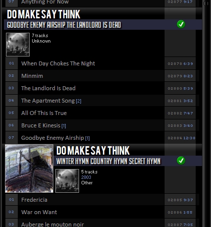
I have highlighted the key improvements that I am now making use of. With these new additions images can be stretched to fit a give frame, for example:
$imageabs2(100,100,,,100,100,5,,$replace(%path%,%filename_ext%,*.jpg),NOKEEPASPECT)
This will display an image (finds any .jpg in the song's directory thanks to the new wildcard function - * is the wildcard) and stretch it to fit a 100x100 frame. Expanding upon this using the new fileexists function:
$if($fileexists($replace(%path%,%filename_ext%,*.jpg)),
$puts(albumMarg,110)
$puts(datax,160)
$imageabs2(100,100,,,100,100,5,,$replace(%path%,%filename_ext%,*.jpg),NOKEEPASPECT)
$imageabs(5,,images/artoverlay-1.png ,)
$drawrect(5,0,100,100,brushcolor-null pencolor-0-0-0)
$drawrect(6,1,98,98,brushcolor-null pencolor-150-150-150)
,
$puts(albumMarg,10)
$puts(datax,60))
This checks that the images is there, if it is it defines a specific margin for later use in positioning of artist, album and trackinfo. It then draws the image, a PNG overlay and some surrounding borders. If the image doesn't exist it defines a different margin so that the song data does not surround an empty space and instead is closer to the left, for example:


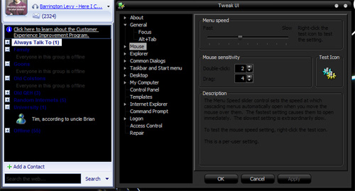
MSN & Microsoft's Tweak UI
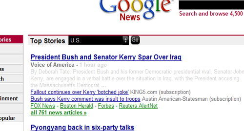
No matter what you do, that black text cannot be fixed, no matter what you do that blue header and frame in MSN cannot be fixed - no tweak will suffice. All black themes face these problems. The only way of fixing such issues I imagine is to apply a custom visual style to each problematic application and the only program that allows this, as far as I am aware is WindowBlinds, which I shudder to use as I like my system resources. This problem extends to browsers wherein web-pages adopt the default color schemes; browsing under the guise of blackness you become aware of the sites that assume everyone uses a black on white setup and the problems in creating an incomplete or ill-defined CSS stylesheet. For example, defining the backgrounds as white but leaving the default text, defining text-color within an input box but not its background color, visa versa, etc. In IE this cannot be fixed remotely and your theme becomes absolutely impossible to tolerate:

But in Firefox this problem can be fixed by overriding default theme values via the UserContent.css file, found here:
C:\Documents and Settings\USERNAME\Application Data\Mozilla\Firefox\Profiles\PROFILE\chrome
for a standard installation. I added these settings:
textarea {
background-color: #ffffff;
color: #000000;
border: 1px solid #bbb;
padding: 2px;
margin: 2px;
}
/* Fixes input and button colours */
input {
background-color: #eeeeee;
color: #000000;
border: 1px solid #bbb;
padding: 2px;
margin: 2px;
}
/* Fixes dropdown box colours */
select {
background-color: #ffffff;
color: #000000;
border: 1px solid #bbb;
margin: 2px;
}
Which changes the page (and others that rely on default schemes) to look like this:

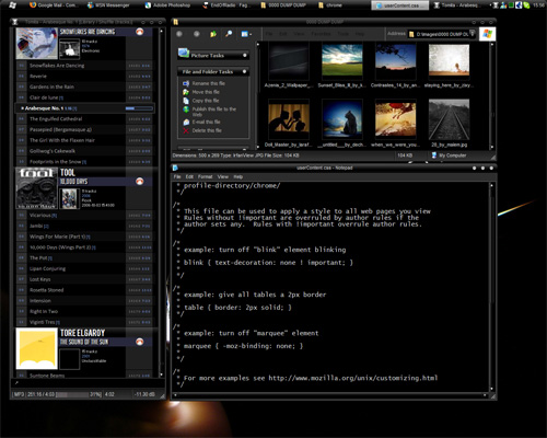
A significant and usable improvement that allows for an improved and enjoyable browser experience. Note: It seems Firefox defines text-colour default to black and ignores the themes value, so no changes have to be made here. To have a browser working within a black theme becomes a significant benefit and the problems and woes of the few assorted clashes elsewhere become tolerable. Now a beautiful black theme such as Inverso-Reborn-Balanced can be used functionally in day to day life without just looking pretty (screenshot showing Foobar, Explorer and Notepad):

If only more applications allowed complete CSS re-styling of their user interface.
Labels: Technical